>Do Not Adjust Your Set
>
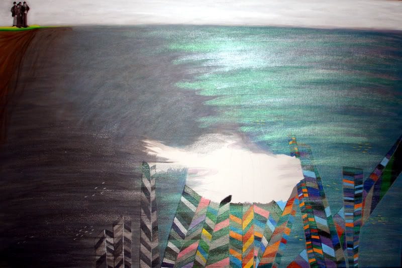
This is only a test. I wanted to see what my underwater painting looked like in the light, so I took the following photo with a flash. :)

(24 x 36")
I think every painting has its key element, and in this one it is a particular paint colour. Golden Acrylic Interference Green. When you look at this paint from difference perspectives, interference colors flip between a bright opalescent color and its complement. That means it looks cool in different types of light! This green is a very fine iridescent-like green which is almost metallic. When you squeeze some out of the tube, it almost looks white, until you apply it to the canvas. I love it, and it's exactly what I needed! Now, it will look like my beaded Beatles Yellow Submarine is passing from the Sea of Nothing to a shimmery Sea of Green. Cool.
I'm going to have a look at it in natural light before I decide, and if it looks good, I think I am almost finished with my painting! I have a few tiny touch-ups to do, as well as paint the bottom edge of the stretched canvas. Then, I will attach the hanging hardware and stitch all of my beadwork into place. Please tune in this weekend for what will hopefully be the finished piece. :D


